From Selawik, Alaska, Iñupiaq artist Norma Ballot shares some local wisdom:
“You don't mess around during berry picking season,” she laughs.
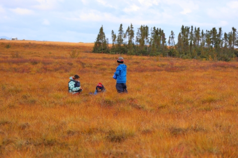
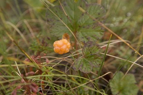
In this small village north of the Arctic Circle, everyone tracks the ripening of the aqpik (cloudberry), from hard to just-right, to make the most of the short few weeks for harvest. "People would be saying, 'Oh, how are our aqpiks?'" Ballot explains. "We listen for word from the community, from people out on the tundra.”
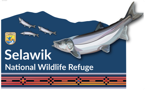
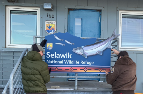
This intimate knowledge of seasonal rhythms - when berries ripen, how weather affects harvest, which colors signal peak ripeness - is now woven into an unexpected place: the new blue entrance sign outside Selawik National Wildlife Refuge headquarters in Kotzebue. A geometric motif runs along the base, with the center of each diamond in the design featuring a different berry color: the bright orange of aqpik, the deep hue of blueberries, crowberry black, and the rich red of cranberries.
Even the design’s background captures a specific moment in time: the layered colors come from Ballot’s photograph of a sunset, taken from her house. And if you look closer at the top edge of the sign, you might notice the rolling, wave-like edge that is actually a silhouette outline of the hills visible from the village of Selawik.
A unique form of art: adding the qupak
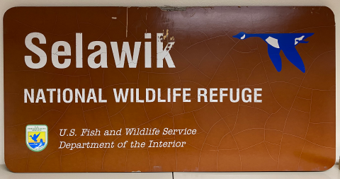
The new sign represents a departure from the former standardized federal design – a flat brown rectangle with letters that had no connection to the place it signified. Integrating local design elements into the 2024 version emerged from a collaboration between refuge staff and community artists, sparked during a chance conversation at the Kotzebue airport between Ballot and Brittany Sweeney, Assistant Refuge Manager for Selawik.
Sweeney knew that the refuge sign needed replacing, but felt a partnership on the design could result in something much more meaningful. The magic began to happen when Ballot, Sweeney, and Christina Nelson, former refuge educator and artist, discussed possible concepts.
For the distinctive pattern running along the sign's bottom, Ballot drew inspiration from a long cultural tradition and the work of another artist: her daughter’s parka creations. She based the geometric motif on the parka’s qupak, a signature decorative trim added to many parkas in western and northwestern Alaska.
"It's a unique form of art," Ballot explains, describing how a seamstress will layer and combine strips of bias tape to create intricate designs, with colors and patterns that often signify a specific region, community, or family. Before the introduction of bias tape, Iñupiaq and Yup’ik artisans crafted the qupak from a variety of natural materials, including fur scraps and reindeer pelts. Modern Indigenous designers incorporate new materials while still evoking cultural style elements.
Inspiration from the land: teaching and artistry
Selawik Refuge has often benefitted from collaboration with Ballot. As a long-time educator, Ms. Ballot often hosted refuge staff in her classroom for lessons on local flora and fauna. She has been a key part of the Selawik Science-Culture Camp - jointly hosted by the refuge and Native Village of Selawik Tribe - for most of its nearly 20-year span.
After teaching bilingual education for 27 years, Ballot now serves on the regional Elder Council and language commission. Her artistic practice spans multiple mediums - from ivory carving to skin sewing, from drawing to sculpture. She finds inspiration in materials gathered from the land: driftwood, feathers, old bones, anything that catches her eye while berry picking. "Art is kind of like a hobby to me," she says modestly, though her work helps preserve and evolve cultural traditions. Her camp, situated about two hours upriver from Selawik village, speaks to the deep history of the area - she's found both clay pot fragments and a traditional stone ulu there, suggesting it has been an important site for generations.
Culture and ecology: the swimming sheefish
Ballot generously hosts students at her Upinġiivik campsite during the annual culture camp and other outings. Christina Nelson had worked with Ballot on education programs in the past, and Sweeney reconnected them to integrate local design: “and that was the synergy!” Sweeney remembers. Nelson translated Ballot’s vision into digital form and also helped bring a regional wildlife ambassador image to life.
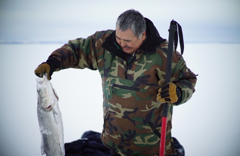
At the top corner of the sign, a swimming sheefish pursues smaller prey, its mouth open in pursuit. This isn't just artistic flourish - it represents a species central to life in the northwest Arctic. The word “Selawik” comes from the Iñupiaq word for sheefish, sii. In addition to berry picking, harvesting sheefish is part of the strong food culture here, and a key to food security. One of the purposes of the Selawik Refuge is to protect the spawning area of sheefish on the upper Selawik River. The impressive silver fish’s presence on the sign acknowledges both its ecological and cultural significance.
“We could see our culture in the design”
For Ballot, the sign represents something larger than just marking a building. "Compared to that old sign – it was just like a piece of paper that didn’t represent anything other than the printed letters on it. But this one, this one represents our people," she says. "We could see our culture in the design."
The project demonstrates how small changes in representation can make a big difference in how people see themselves reflected in public lands. "We wanted something that illustrated that this isn't just an empty place or just a home for wild creatures. It's also a homeland for people," explains Sweeney.
Ballot offers straightforward advice for similar projects: "If you want to come up with something beautiful, you contact the local people. They'll guide you through the way and come up with something awesome."
Sweeney hopes people see their culture, their seasons, and their way of life reflected every time they pass by. "We couldn't be happier with the outcome," she says. "That's why we're hosting an open house to show it off and tell the story so that when people come by on the street, they know that this is their refuge."
The finished artwork of the sign shows how federal lands and local communities can work together to create something that truly represents both mission and place - starting with something as simple as paying attention to when the berries ripen.
When asked what she hopes people see in the new sign, Ballot answers simply: "Life."
In Alaska we are shared stewards of world renowned natural resources and our nation’s last true wild places. The lands and waters of this place we call home nourish a vast and unique array of fish, wildlife and people. We cultivate a reverent awareness and respect for all things, from Alaska’s smallest plants and most iconic animals to its diverse communities and cultures. Our hope is that each generation has the opportunity to live with, live from, discover and enjoy the wildness of this awe-inspiring land and the people who love and depend on it.
Additional credits:
Quyanaqpak (thank you very much) to Norma Ballot for taking the time to share her art and her perspectives.
Thank you to Brittany Sweeney for collaborating on this story, and to Christina Nelson for contributing her talents.
The Selawik Refuge is grateful to Jenny Eberlein for her invaluable assistance throughout the sign design and replacement process.
We are also grateful to artist Sara Wolman for her initial work to create animal ambassador illustrations used in new refuge signs across the nation, and for the base illustration of the sheefish.


