North American Bee Distribution Tool Information and User Guide
The North American Bee Distribution Tool is an interactive portal that allows for rapid assessment of apparent bee species richness throughout the United States, Canada, and Mexico. The Bee Tool incorporates species occurrence data of six families of bees using data provided by Global Biodiversity Information Facility as well as conservation status rankings provided by NatureServe. Users can filter from a variety of options, such as temporal range, geographic location (country, state, county), NatureServe conservation status, or taxonomic classification (family, genus, species).
This portal may allow practitioners to assess:
- Lists of observed bee species
- Bee species richness across space and time
- Richness of potentially at-risk bee taxa
- Species distribution models for 529 unique species
- Apparent abundance
- Phenology of bees by month
- Ecological network models for 129 unique species
How do I use the Bee Tool?
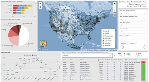
The Bee Tool is comprised of a central map showing spatial distribution of bee species occurrence records, along with interactive figures (graphs and charts) and a species information table. Users typically interact with the Bee Tool by filtering the occurrence records by time, geographic location, taxonomy, or conservation status. The interactive figures update instantaneously based on filters chosen, and the total number of occurrences. The total unique taxa will always reflect the information shown on the map.
Jump to section:
Map Visual
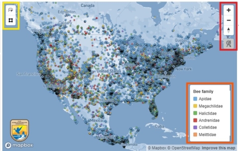
The points on the map show bee occurrences separated by color, indicating one of six bee families, see the legend. Note: the map will often truncate the number of dots displayed at any given time to improve the speed of the map displayed. For example, if there are two million bees currently shown in the occurrences counter on the right side of the Bee Tool, the map might only display a few thousand of those dots. Filtering to a finer-scale geographic area will show a more accurate representation of bee distribution in that area.
Hovering your mouse cursor over a point:
- Reveals the family of each bee found at that point
- Reveals the data source of the observation (U.S. Department of Agriculture, iNaturalist, museum/academic sources, etc.)
Clicking on an individual point:
- Filters all other figures and tables in the Bee Tool to show specifically the bee(s) found at that location.
- Click away from the point and the map will return to the previous state.
You can click the Zoom feature to zoom in or out on the map or simply use your mouse wheel. You can also click on the Auto-Zoom function (automatically disabled) to automatically expand or zoom the map based on your geographic filters.
The Lasso and Polygon tools allow you to highlight a certain subset of displayed points on the map. With the Polygon tool, simply click anywhere on the map and draw a rectangle around the group of points you wish to analyze. The Lasso tool works in a similar way, and you can draw a freeform boundary around specific points instead of strictly drawing rectangles. To un-select any points from either the Polygon or Lasso tool, simply click anywhere on the map outside of area you’ve selected.
Filter Options
The drop-down filters are an integral part of the North American Bee Distribution Tool. These filters essentially query the entire bee database, quickly fetching records based on your selections. However, the filters remove the necessity for you to understand how to write database queries and are therefore much more intuitive to use.
The state and county filter at the top of the panel allows you to select specific states or counties within states. Click the drop-down filter and unselect “Select all” (if necessary) and click the box next to the corresponding state which you’d like to view. To view the counties within a specific state, click the triangle to the far left of the state name, and the counties will be listed in alphabetical order.
The NatureServe conservation status filter allows you to choose specific bee taxa that is assessed by NatureServe (note: only roughly 16% of the total bee species in this Bee Tool are assessed). For example, if you wanted to know how many bees in the United States are classified as critically imperiled (G1), simply click the drop-down box, and choose “G1: Critically Imperiled”.
The family or genus filter allows you to retrieve records of bees based on taxonomic level. For example, if performing a quick assessment on bumble bee species, you click the drop-down box and click the arrow next to Apidae (long-tongued bees) and choose the genus Bombus.
Select multiple filters by:
- For a PC, hold the Control (Ctrl) key to select multiple filter options
- For a Mac hold the Command (⌘) key to select multiple filter options
Reset all filters back to default by:
- Clicking the Reset button or the eraser icon located at the top corner of each filter option.
The Date Range Slider allows you to filter the entire database to select a specific range of dates. Simply slide the leftmost button to select the from date, and the rightmost button to select the to date. Alternatively, you can click the left date box to select the from date and the right date box to select the to date.
The Taxonomic Search Bar allows you to quickly filter the Bee Tool by genus or species name, or partial name. For example, entering Bombus will show all bumble bees in the Bee Tool, but entering “Bombus pens” will only show the American bumble bee, Bombus pensylvanicus. Click the eraser tool on the right to clear.
Interactive Visuals
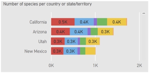
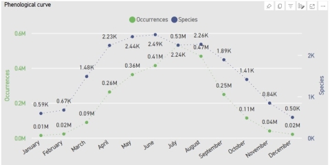
The three figures at the left side of the Bee Tool are the bee richness per state (or county) bar graph, the pie chart showing the number of bee taxa per NatureServe conservation status, and the phenological curve chart showing total number of bee taxa and number of total bee occurrences per month. These charts are all interactive, meaning various sub-portions of the charts are clickable to gain rapid assessment of bee taxa per category.
The interactive taxa per state (or county) graph shows the number of bee taxa per state or county. It is divided into colors based on the family of bee; this color coding corresponds with the map legend. By default, the graph shows species totals ordered by state. To show counties, hover the mouse over the graph and click the double down arrows icon.
Hovering your mouse cursor over a specific color block will show the number of bee species within that specific family for that specific geographic region. Alternatively, you can click on any color bar for any state or county, and the entire Bee Tool will update to reflect the statistics for those selected species.
The phenological curve graph shows the abundance with a green line and richness with a blue line by month for all bees throughout time in the Bee Tool. This visual becomes especially relevant when focusing on specific geographic regions or specific taxa. For example, the phenological curve showing the total number of observations and total species richness in the state of Minnesota will look much different than the curve shown in Arizona due to latitudinal differences in climate.
The curve will also show the total number of observations for any individual species per month. For example, Bombus griseocollis abundance peaks in July, whereas Bombus pensylvanicus appears to be a later- season bumble bee, peaking closer to September.
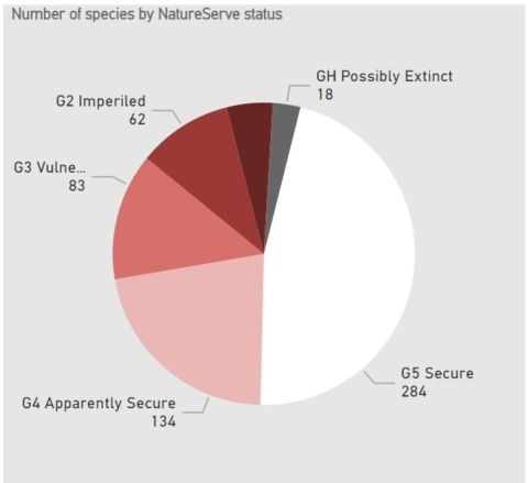
The NatureServe conservation status pie chart shows the total number of species per NatureServe conservation status and their relative percentages. The chart only includes those species which have been assessed by NatureServe and assigned a rank. This means that while there are close to 3,700 bee species identified in this Bee Tool, only roughly 550 of them have currently been assessed. Therefore, the percentages shown in the chart are relative to the number of assessed species and not the overall community of bees.
As this is an interactive chart, you can click on any of the pie slices to filter the entire data in the Bee Tool.
Species Information Table
The species information table shows a list of all filtered (or unfiltered) species. This table will update based on any selections made in the Bee Tool, including drop-down filters, the date range slider, taxonomic filters, etc. The list is automatically sorted by the number of occurrences from greatest to least. As with most visuals in this Bee Tool, each species name is clickable to quickly show the distribution of that species on the map.
The table consists of information and clickable links for each species:
- Bee family
- Species name
- Occurrences (number of occurrences in the database)
- Known host plant(s) link, provided by Global Biotic Interactions
- Taxonomic page on DiscoverLife, includes photos if available
- Taxonomic page on Bug
- Guide, includes photos if available
- Intergrated Taxonomic Information System
- NatureServe Conservation Status has a clickable link to corresponding page outlining how they have assessed the ranking for each species, if ranked
- The Native status of each species. Species that are native to North America are green, while species that are classified as non-native are red.
Exporting Data
Once users have applied the desired filters to the visuals on the page, the data can be exported in a variety of ways.
Exporting entire page
To export the entire report page, click the “export” button at the top of the report page and choose the desired export format.
Exporting data visualizations and tabular data as a .csv file
To export a specific visualization, such as a pie chart or bar graph, first, select the visual by clicking on it. Once the visual is selected, a menu will appear either in the top-right or bottom-right corner of the graphic. Hovering the mouse over each option in the menu will provide information on the different options for exporting the visual. To export the data used to create the visual or table as a comma separated value (.csv) file, select the three dots that appear in the menu, then select “export data”, and chose the desired export option. Power BI can export a maximum of 150,000 records from the Bee Tool.
U.S. Federal Parcels Page
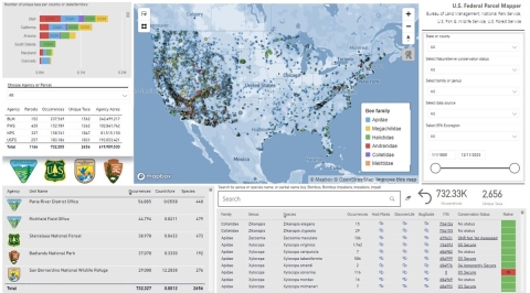
The U.S Federal Parcels page allows users to view species occurrence data associated with federally managed lands. Filter by agency or parcel to view occurrence records within the boundaries of the selected parcel or parcels.
The Federal Parcel Summary table displays summary information for the selected agency or parcel. Users can view the selected agency, the number of selected parcels, the number of occurrences and unique taxa within the selected parcel or parcels, and the total acreage of the selected parcel or parcels.
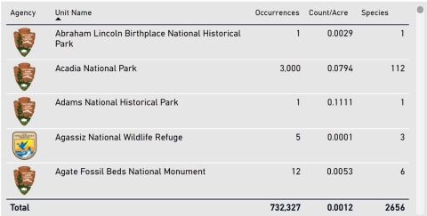
The Parcel Occurrences table displays information about individual parcels. The agency can be determined by the icon representing each land management agency. The unit name is the name of the parcel. The number of occurrences, individual occurrences per acre, and total unique species is also displayed. Federally managed parcels are sourced from the Protected Areas Database of the United States.
Visuals on the page will automatically update based on the filters applied by the user.
Ecoregions Page
The Ecoregions page provides users the opportunity to look at species distributions at the ecoregion levels I, II, and III. Users can filter by ecoregions using the filter bar titled “Select EPA Ecoregion”.
Users can also filter the data by making selections in the graphs or visuals. The decomposition tree provides information about unique taxa occurring within each level ecoregion. The EPA Ecoregion matrix provides the number of unique taxa within each ecoregion by NatureServe global conservation ranking. Visit the U.S. EPA Ecoregions website for more information about Level I, II, and III Ecoregions.
Sampling Effort and Richness Page
This page provides estimations of sampling effort and mean species richness at the state or territory (Mexico and Canada), and county (United States) spatial resolution. Users can view county-level estimates of species richness and sampling effort to prioritize monitoring efforts in under-sampled counties.
The Rarefaction Curve by county or state/territory for Mexico and Canada provides a visual comparison of richness (y-axis) and sampling effort (x-axis) for each delineated spatial unit (county, state [Mexico], and territory [Canada]). The values of each axis can be adjusted to various scales using by sliding the upper and lower limit circles located at the start and end of each axis.
The table on the lower left provides detailed information about richness and sampling effort per U.S. county, state (Mexico), or territory (Canada). The Rho value provides a means to compare richness and sampling effort across these spatial units. Units with Rho values highlighted in green are generally better-sampled and have higher richness than those with yellow to red values. Units with a Rho value of zero do not contain any species occurrence records. This table is meant to help users determine which units are under-sampled and may therefore be good candidates for targeting sampling.
Distribution Models Page
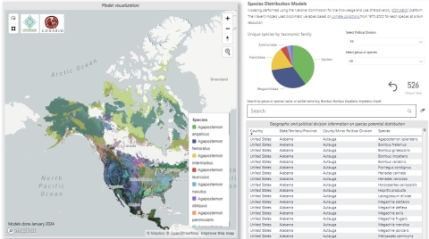
This page provides species distribution models (SDMs) for 526 North American native bee species. Modeling was performed using the National Commission for the Knowledge and Use of Biodiversity (CONABIO) platform. The Maxent models used species occurrence records and bioclimatic variables based on climate conditions from 1970-2000 for each species at a 5km resolution.
Users can filter SDMs by major and minor political divisions, or by genus and species using the filter options on the right side of the page. Users can also select SDMs on the map, although this is not recommended in geographic areas where multiple SDMs overlap.
Page development credit: Commision for Environmental Cooperation (CEC), The Southern Border College (ECOSUR), Commission for the Knowledge and Use of Biodiversity (CONABIO), Commission of Protected Natural Areas (CONANP), Institute of Ecology (INECOL), and National Council of Humanities, Science and Technology (CONAHCYT).
Ecological Networks Page
This page provides links to ecological network models for 159 North American native bee species. For the visualization of interactions in the Bee Tool from taxonomic and geographic perspectives, three steps were performed.
First, a specialist in plant taxonomy updated, unified, and curated the nomenclature and taxonomic authority of the list of plant species associated with the 159 bee species.
Second, two analyses were performed inference networks and ecological niche from potential bee-plant interactions. From these analyses, interactive graphical results and two statistical attributes associated with the spatial concurrence patterns between each bee species with the plant species on which floral visitation data are available were obtained: epsilon and score. Both analyses were conducted on the SPECIES platform as indicated on its webpage, on the basis of data downloaded from Global Biodiversity Information Facility and Mexico's National Biodiversity Information System. In all cases, a 32 km2 resolution grid over continental North America was used to estimate interaction statistics between bees and their floral counterparts.
Third, links were generated per bee species that redirect to a SPECIES interface designed explicitly for users to visualize and download the results of both analyses.
Epsilon and Score are statistics that are calculated from the spatial concurrence between pairs of species, such as bee species vs. plant species. In ecological terms, Epsilon is expressed in standard deviation units, so if the values are more significant than +3 or less than -3, it is interpreted that concurrence or non-concurrence is more likely than expected by chance. Epsilon is calculated for all species and not in a particularly explicit way, i.e. it is calculated from the total of special concurrences (from the records in X and Y coordinates) between each bee and plant species. The Score, in ecological terms, is a coefficient that indicates how much of the spatial distribution of a plant species is positively or negatively related to the presence of the bee species. Unlike Epsilon, the Score is calculated at the level of each pixel (e.g., 32 km2). The Score also varies between -infinity and +infinity, so the higher and positive the Score value of a plant species, the higher the probability that it is positively associated with the presence of the bee species. In the opposite case, negative Score values can indicate antagonism.
Page development credit: Commission for Environmental Cooperation (CEC), The Southern Border College (ECOSUR), Commission for the Knowledge and Use of Biodiversity (CONABIO), Commission of Protected Natural Areas (CONANP), Institute of Ecology (INECOL), and National Council of Humanities, Science and Technology (CONAHCYT).
Caveats, Limitations, and Other Information
As with any tool modeling the natural world, it is important to understand limitations with these models based on imperfect data and be aware of making conclusions about species distributions or trends without more rigorous analyses. This Bee Tool is intended to be a starting point for analyzing potential patterns in bee richness across space and time and may help identify research topics for further consideration.
Data Limitations
The data included in this Bee Tool are almost entirely collected from Global Biodiversity Information Facility with no guarantees for taxonomic, locality, or date accuracy. Therefore, the information this Bee Tool provides in terms of species distribution and richness may not be completely accurate. This is especially true when analyzing bee distribution at extremely fine spatial or temporal scales. However, at increasingly broader scales, errors in data may become more dilute and trends and distributions may be relatively representative of the natural condition. Additionally, this Bee Tool does not incorporate absence data and only makes use of presence data.
Location Bias
You may find that there are large swaths of areas which are relatively depauperate in bee occurrence data, especially within regions far from human population centers or away from areas near research universities. This does not mean these are dead zones for bees but rather may simply be too far for many bee sampling projects to take place. In contrast, this also does not suggest that urban or heavily populated regions are especially important habitat for bees.
Non-Systematic Sampling Regimes
There are very few multi-year bee sampling projects in North America, especially those surpassing more than 10 years. Many bee sampling projects are infrequent and opportunistic, and therefore bee occurrence data may appear spotty and inconsistent over space and time. A particular bee species may be abundant within a specific geographic region and may not be observed for dozens of years, simply due to a lack of monitoring efforts in that area.
Changes in Bee Taxonomic Classification
Bee taxonomic classification is constantly shifting, and we cannot assume any digitized specimens in large occurrence databases have been updated accordingly. To help mitigate some of these types of errors, only Intergrated Taxonomic Information System confirmed taxa are included in the Bee Tool .
Data Updates
Data from this Bee Tool are typically updated three to four times per year. The Bee Tool developers are exploring different options for increasing the frequency of data updates and anticipate future versions of the Bee Tool to utilize live data pulled directly from the Global Biodiversity Information Facility Application Program Interface (API).
